The Landing Page Playbook
A working guide for sharpening your above-the-fold copy
Who this is for: Founders writing or revising the top of a landing page, a product demo page, or an MVP launch page. It works for pre-launch pages, first-version sites, and existing pages that are not converting.
How to use it: Read once end to end (about 15 minutes). Then open your current page alongside the five-question audit at the end, and rewrite the header, subheader, and CTA in that order. Most founders finish a usable v2 in about 90 minutes.
What this replaces: Generic "landing page best practices" advice written for companies that already have brand equity. The rules below are calibrated for founders whose visitors have never heard of them.
The core idea
Your above-the-fold (ATF) is the part of the page visible before a visitor scrolls. It has one job: answer two questions fast enough that the visitor keeps reading.
- 1.What does this company do?
- 2.Is it for someone like me?
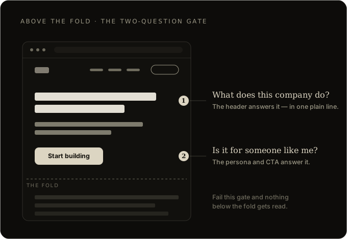
Everything else on the page is for visitors who got past this gate. If the ATF fails, nothing below it matters.
The most common mistake is adding a third job: impress the visitor. Impressing and qualifying are not the same. Clever copy that leaves the visitor unsure what you sell has failed, however well it reads.
Specificity beats magic
Most landing page advice tells you to find your product's "magic" and put it in the header. That advice is written for companies with existing brand equity. You do not have that yet.
When nobody knows who you are, ambiguity reads as noise, not intrigue. A visitor will not spend a second cognitive cycle decoding your cleverness. They will bounce.
The rule for founders without brand equity is the opposite of what you will read elsewhere:
- Be specific first.
- Be interesting second.
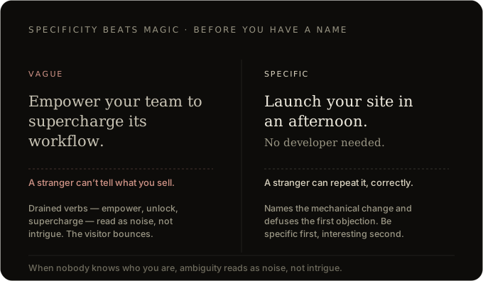
Quick test: If a stranger reads only your header, can they tell a friend what your company does in one sentence, without getting it wrong? If no, the header is not done yet.
Writing the header
Three moves, in order. Do not skip steps.
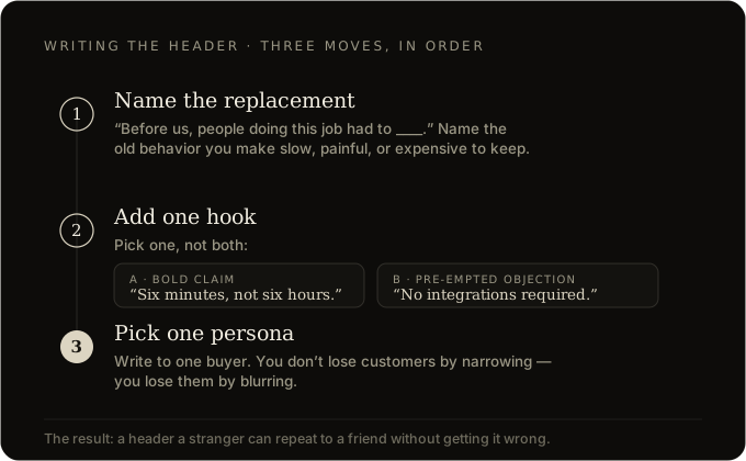
Step 1: Name the replacement
Before opening the design file, finish this sentence on paper:
"Before our product existed, people doing this job had to ____."
That blank is your raw material. Your product exists because some current behavior is slow, painful, expensive, or embarrassing. Name the behavior. Write the sentence that says what changes when you replace it.
Avoid: streamline, empower, unlock, transform, revolutionize, supercharge. These verbs have been drained of meaning. Use verbs that describe the actual mechanical change your product makes.
Step 2: Add one hook
A hook is one of two things. Pick one, not both.
Option A, a bold specific claim. A number or outcome that makes the reader think "wait, how." Examples:
- "Six minutes instead of six hours"
- "Without writing a single line of code"
- "Ten dollars a month instead of a thousand"
Option B, a pre-empted objection. The first skeptical thought a reader has when they see your claim, defused in six words or fewer. Examples:
- "No integrations required"
- "Works with your existing stack"
- "Starts free"
How to choose: If you have talked to 10 or more target users and know the first thing they push back on, use Option B. Otherwise go with Option A and stay specific.
If neither option works, the problem is not the header. You have not talked to enough users. Fix that first.
Step 3: Pick one persona
Write to one buyer. Not everyone who might conceivably use your product.
Why: The founder instinct to keep the door open for every adjacent use case is the same instinct that produces vague headers. You do not lose customers by narrowing. You lose them by blurring.
If you genuinely serve two personas: Build two landing pages, one URL per persona. That is faster than rewriting a vague header six times.
Writing the subheader
The header makes a claim. The subheader makes the claim plausible.
Pick one of two jobs:
Job A, explain the mechanism. One sentence on why your claim is possible.
Example:
- Header: "Launch your site in an afternoon"
- Subheader: "Pick a template, drop in your copy, publish. No developer needed."
Job B, name two or three concrete features. Fewer than three. Six features makes this a feature list, and feature lists belong below the fold.
The trap to avoid: over-hedging. Founders get nervous about bold headers and soften them in the subheader.
Bad: "Our platform helps teams of all sizes potentially improve their workflows."
This sentence actively subtracts confidence from the header above it. Cut it.
Quick test: If you deleted your company's name and pasted a competitor's in, would the subheader still be true? If yes, rewrite it.
Writing the CTA
Most founder CTAs read like a request. "Book a demo." "Request a meeting." "Contact sales."
These are fine once the visitor has decided to talk to you. On the ATF they are premature. You are asking for commitment before delivering the payoff the header promised.
The rule: The CTA should be the next sentence in the story your header started.
| If your header promises... | Weak CTA | Strong CTA |
|---|---|---|
| Ship faster | Request access | Start building |
| See your data clearly | Book a demo | See the dashboard |
| Get better matches | Contact us | Find my match |
| Save on taxes | Sign up | Calculate my savings |
For enterprise or high-consideration products that genuinely need a sales conversation: "See how it works" usually outperforms "Book a demo" at this stage.
If you cannot write a CTA that continues the story: your positioning is not finished yet. No button copy will fix that.
Design rules
Keep design conventional. Your product should be distinctive. The page is the medium.
Negative space. Most early landing pages are too dense. Empty space around your header is what makes it readable. When in doubt, delete a section.
Images prove the claim. If the header says fast, show it being fast. If the header says simple, the screenshot should be scannable in two seconds. Blur or crop anything that is not the point.
Short navigation. Two to four links plus your primary CTA. Every extra nav item is a question the visitor answers before scrolling.
Dominant CTA. If a visitor squinted at your ATF from across the room, they should still be able to identify where to click.
Landing page equals pitch deck opener
A pitch deck's opening slide follows the same rules. Specific claim. Hook. Clear persona. Proof of mechanism.
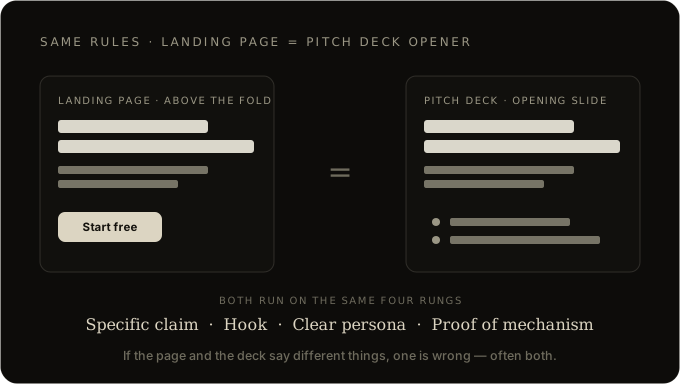
If your landing page header and your deck opener say different things, one of them is wrong. Often both are, and the underlying positioning has not been pressure-tested.
Work on them together. Sharpening the page usually sharpens the deck. Answering a hard investor question usually reveals what is missing from the page. The feedback loop compounds.
The five-question audit
Run this before shipping. Read your ATF out loud and answer each question.
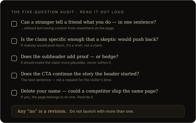
- 1.Can a stranger tell a friend what this company does in one sentence, without adding context from elsewhere on the page?
- 2.Is the claim in the header specific enough that a reasonable skeptic would push back on it? If nobody would push back, it is a wish, not a claim.
- 3.Does the subheader make the claim more plausible, or does it hedge?
- 4.Does the CTA feel like the next sentence of the story, or a request for the visitor's time?
- 5.If you deleted your company name and logo, could a competitor paste theirs in and ship the same page?
Any "no" is a revision. Do not launch with more than one.
Final note
Landing pages do not usually fail because of the copy. They fail because the thinking underneath is still fuzzy, and the page reflects that fuzziness.
If a draft is not working, the fix is usually one layer up:
- Who is this for?
- What are they doing instead right now?
- Why is our thing meaningfully better for them, today, in a way we can prove in a sentence?
Answer those and the ATF writes itself.
The method here builds on Julian Shapiro's landing page work, adapted through our own operating lens.
Apply this to your company, with an advisor across the desk. Share your venture →
Share your thoughts
Write your response here. It goes straight to the Paso team.